Customize
Display Item Selection Dialog
Summary
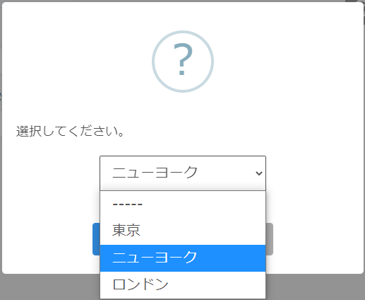
Display a dialog as shown in the figure. Use this action when the user is asked to select one item from multiple options.
How to use
When the action is executed, a selection dialog will be displayed.
When a user selects an item from the dropdown in the dialog and clicks the “OK” button, the action is completed, and the selected item is set as the result of the action.
In this dialog, users cannot manually enter items that are not included in the selections. The item must be selected from the selections.
To extract the items chosen by the user, use an expression.
For example, if the action of “Display Item Selection Dialog” is the first action, you can get the results by setting value in the parameter “Set Field Value” as follows:
=$1
By specifying it like this, you can extract it.
Parameters
Set Message Text, Selection Items, Add 「—–」, OK Button Label, Cancel Button Label, Allow Unselected or not, and Initial Value
Message Text
Enter the text to be displayed in the message part of the dialog.
Selection Items
Enter the options to be displayed in the dropdown, one item per line. Whitespace on both sides of the item name will be removed.
When using an expression in the item name, use ${expression}. “=expression” cannot be used.
Empty lines are ignored. By using the expression, it is possible to display items only when the condition is met by using the If function in the expression, like ${if(condition, item name,'')}.
At least one selection item is required. If all lines are empty, there will be no items at runtime, and “There are no options” will appear.
Add 「-----」
Choose whether to add “-----” indicating unselected as a dropdown option. In the “Selection Items” parameter, empty values cannot be created, so if necessary, use this parameter to set it.
Selecting “Add” will add “-----” to the top of the dropdown. When a user selects “-----”, the action result value will be empty instead of “-----”.
Selecting “Don’t Add” does not add “-----”.
OK Button Label
You can change the label displayed on the OK button using this parameter.
Cancel Button Label
To change the label displayed on the cancel button, use this parameter.
Allow Unselected or not
Selecting “Allow Unselected” will enable the “OK” button to be clicked even when “-----” is selected
Selecting “Don’t Allow Unselected” will disable the “OK” button to be clicked when “-----” is selected.
If you do not add “----" to represent unselected, you cannot set it to unselected state, so this parameter has no meaning.
Initial Value
Enter the value that is selected immediately after opening the dropdown.
If it is left empty, the first item in the dropdown will be selected.
Please avoid setting values that are not included in the “Selection Items.” It won’t cause an error, but it can lead to unexpected behavior.
Precautions
The action is completed when the user clicks “OK” or “Cancel” on the dialog and closes the dialog. The action is not completed when the dialog is displayed.
Even if a user clicks “Cancel”, the action will be completed.
When waiting for the completion of this action with the condition “When Another Action Complete”, please refer to the above note.
If you want to proceed with the action only when the “OK” button is clicked, and not when the “Cancel” button is clicked, use the condition “When OK Clicked in Confirmation/Input Dialog” instead of “When Another Action is Complete.”
Restrictions
- If the “Display Item Selection Dialog” action is executed when another dialog is already open and the user has not yet closed that dialog, the already open dialog takes precedence, and the subsequently executed “Display Item Selection Dialogt” is ignored. In this case, the result of the “Display Item Selection Dialog” action will be treated as canceled.